In an industry with set-in-stone practices and a tried-and-true approach to research in its 120 years old history, how does a market research company step out of bounds while remaining competitive?
We sat down with Dobrinka Vincetijevic, our Shopper Insights Director, for a chat on what flared EyeSee’s start, how our approach to tech reshaped our approach to tech, and ways even the most demanding clients push you forward.
Take it one tech at a time
EyeSee began as a start-up – not the kind that starts in a garage but in a colleague’s mom’s living room! And in those early stages of the company, there was only one guy who covered everything regarding research and data analysis and just one salesperson from Belgium. Fast forward, after many milestones later, there are now 7 offices around the globe from Mexico, Singapore, And New York to Paris, London, Belgrade and Gent!
From the very start, the vision was always to make behavioral research accessible to any company. Traditionally, this type of research implied neuromarketing studies that were – and still are – quite expensive, hard to conduct and take quite a long time to do both in terms of collecting data and analyzing it. Determined to overcome this challenge, EyeSee’s idea was to make the behavioral research approach global, fast and accessible.
And so, we developed an Eye Tracking app that enabled research studies just via webcam and gave us more valuable and reliable behavioral data that we wouldn’t be able to get had we just surveyed the respondents. And then came more tech-enabled and advanced behavioral methods like Facial Coding, RTM and Virtual Shopping that only further powered our drive to uncover more predictable insights at every consumer touchpoint.
The client is always right (and you can learn a lot from them)
Clients have always been our number one catalyst when it came to innovating and perfecting our tech. For example, when it came to virtual shopping, with every client, study and research question that came along, we perfected and tweaked our virtual testing environments to look as closely as they could to the real thing.
From developing interactive 3D packs on virtual shelves, implementing limited budgets for responders to emulate a real shopping trip to even adding ambient music to the virtual stores, each client slowly helped us build realistic shopping environments with distinct consumer features and touchpoints.
Growing pains are a transformation in the making
A huge part of growing is allowing room for experimentation, and our team went through quite the internal transformation and restructure – and while there are still different departments, we saw value in introducing more multidisciplinary teams, the so-called Pods. The idea was to have a team fully dedicated to one client – with all its expertise, knowledge and capacity.That can also be a multiclient team that would focus only on social media, for example. We started to ‘re-pack’ ourselves internally in a way that would allow us to be faster and more agile.
AI is so much more than a buzzword and its versatility never ceases to amaze. Since we are always looking into integrating AI and other tools in smart ways, we are used to operating in in a ‘Beta’ version – there is always something new that is being launched or that needs to be optimized and you think, ‘this is it!’ but then clients or other things challenge you and then you go back and try to change it. So that platitude that ‘the change is the only constant’ is very much alive and well in EyeSee!
Want to read more about how EyeSee grew? These are the 10 formative milestones that have defined our path to impactful behavioral insights!
For the second consecutive year, EyeSee has 3 nominations in the finals of Quirk’s Marketing Research and Insight Excellence Awards! We are immensely honored to be shortlisted and our work and collaboration with Twitter to be recognized in this way.
Our long-lasting partnership with Twitter resulted in an exciting project nominated for the Advertising Research category – ‘(Non)traditional gender roles in sports ads’. The pioneering study was also presented earlier in the year at Quirk’s Online event, and the webinar session can be found here. Our team is also thrilled that Michelle Grushko, who is a Data Scientist, Marketing Insights & Analytics, at Twitter and worked on the project, is one of the finalists in the Researcher of the year (client-side) category.
Aside from representing industry recognition, this nomination is a reminder of how far our team has come since winning the Global MR research project Award with Microsoft in 2019. Since then, despite the challenges, we hit a big milestone – EyeSee grew to over 100 employees, having been joined by amazing experienced professionals from the MR field, and fresh young talents alike.
The Marketing Research and Insight Excellence Awards, powered by Quirk’s Media, recognize the researchers, vendors and products and services that are adding value and impact to marketing research. Finalists are selected by a panel of judges made up of a combination of end-client researchers, supplier partners and Quirk’s editorial staff. For more information about The Marketing Research and Insight Excellence Awards visit quirksawards.com
With e-commerce expected to grow to nearly double by 2023 to more than $6.5 billion globally, it gives rise to new opportunities for brands to be competitive. However, market research in the online domain is still in its early stages, with brands often opting for a much wider variety of research questions and a lack of focus in comparison to brick-and-mortar studies.
So, how to set up the e-commerce testing approach with actual impact? Our collaboration with Microsoft was recognized in the highly competitive category as the Global Market Research project of the year at the Marketing Research and Insight Excellence Awards by Quirk’s last November.
Based on this successful collaboration, Sanja Cickaric, EyeSee’s leading expert on UX and e-commerce shared takeaways and 3 steps for testing your online platform more effectively:
Step 1: Choose the level of the study and invest in the bottom-up approach (start with tactical, and then address strategy), which willprovideyou with have quick wins that demonstrate impact to your stakeholders.
Step 2: Combine the right conventional (survey) and behavioral (eye tracking, virtual shopping) methods to increase the predictability by up to 30%.
Step 3: Test in-context on a (mockup of a) specific website
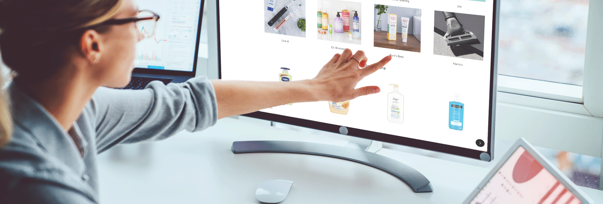
With online shopping booming, significant growth opportunities are opening up for retailers and brands. To take advantage of this potential, companies need to invest in a clean and streamlined user experience, but some webpage elements are more important than others. It was found that product pages are one of the key factors that can make or break your online sales.
To unveil the basic elements that drive conversion on these pages, our team conducted an eye tracking study analyzing the leading retailers’ product pages – Walmart, Amazon, and Target. The research showed that shoppers are 14% more likely to buy the product from Walmart than from the other two retailers after browsing their product pages. Our goal was to discover the elements that correlate with purchase intent and offer recommendations for both retailers and their client companies.
We conducted our study in partnership with the panel company Lightspeed. The recruited 300 online shoppers were asked to browse two product pages of their preferred online grocery shop while the EyeSee team tracked their eye gaze. We chose popular brands within two large categories: Colgate (toothpaste) and Tide (laundry detergent). Afterwards, the online shoppers were asked to choose products they would prefer to buy.
Why is the product page so important?
You may think of a product page as an equivalent of picking up a product with one’s hands and mulling over the purchase. Many questions emerge in this thought process, but most of these activities take place in the subconscious part of the mind of which we are seldom aware. By changing features of the product page, we can influence both conscious and subconscious aspects of the decision-making process.
Walmart’s 14% sales conversion advantage
More than half of the shoppers (i.e. 53%) who land on the Walmart product page also end up purchasing the product, while only 47% of Amazon- and 46% of Target-based shoppers make the purchase after browsing the product page. What drives this 14% advantage?
Although all three pages have essential elements that help to drive successful online sales, Walmart’s product page has slight advantages: • Larger product image; • Visible and user-friendly “add to cart” section; • Visible and user-friendly size and quantity options.
Walmart shoppers spent up to 70% more time browsing product images
Eye tracking enabled us to measure the amount of time online shoppers spent gazing at the different elements of the product pages. At Walmart, they paid much more attention to the product image: 23% out of total time spent per page, with much lower rates on Amazon and Target pages (i.e. 14% and 17% respectively).
Given its larger size, design, and proximity to the product image, the “add to cart” section yielded a greater number of views as well. On top of that, Walmart’s “add to cart” is considered to be much more relevant and useful for purchase decision than the same section on other websites (30% better than Amazon and four times better than Target).
Key performance indicator: time spent looking at the image, not the page
While the time people spend looking at the product image is positively related to purchase intent, this is not the case with the time spent on the page as a whole. Amazon holds shoppers on the page 50% longer compared to Walmart and Target, but this alone does not translate into purchase intent.
Exploring the product image for a longer period of time shows positive emotional engagement – in this case, consumers presumably like what they see and are interested in learning more.
However, spending too much time on the product page might also indicate confusion. It is possible that the consumers could not find what they were looking for or that the page was not entirely user-friendly. Shoppers might find this frustrating and give up on further browsing of that particular site.
(Product) image is worth a thousand words
Product picture is the most attention-grabbing element of the product page. It is the first-to-be-seen and the-longest-looked-at element, taking in around 20% of the total time dedicated to the product page. This section is one of two areas considered the most useful and relevant to the purchase decision.
A shopper can obtain a lot of information about the product just by looking at the image; he/she does not need to read the description to make a purchase decision. Also, since people base their purchase decisions on the package design while shopping in the store, it makes sense that they’re influenced by the product image in an online environment. Plus, images attract more attention in general and communicate more efficiently than words.
Optimizing the product page
Optimization of the product page should be focused on the most important areas of the page. According to our data, these are (1) the product image and (2) “add to cart” section, followed by product name and suggested products. People devote most of their attention to these areas and consider them useful and relevant to their purchase decision.
Size matters. To make the most of the online “moment of truth,” product image should be optimally sized, at a high resolution and well positioned. Multiple-angle product images are an added bonus. On average, respondents spend more time looking at larger product images, as they attract more attention, which is positively correlated with the purchase intent. On the tested pages, the product image area with Walmart is twice as big as the same area with Amazon and 1.5 times bigger than with Target.
Another example of good practice demonstrated by Amazon is boosting the product image area with hero shots (visually presented product benefits). This “detail” has turned out to be very useful and relevant to the purchase decision.
Tweaking the “Add to cart” section. It’s vital for this section to be clear and user-friendly. Walmart’s design takes the prize, being large, with sizeable buttons and print, and positioned close to the product image. The information offered is clear, with important details highlighted (price, discount, shipping etc) and excessive ones omitted. This design attracted the most attention compared to other sites, as all these factors contribute to better visibility. On average, 92% of respondents noticed this section on the Walmart webpage, 86% on the Amazon page and 34% on the Target product page.
Amazon’s “add to cart” is overloaded with small-print and is potentially missing the most relevant information – therefore, visitors don’t consider this section useful and relevant for their purchase decision (on average 4 times less frequently than on other websites). Target, on the other hand, has too poor “add to cart” section, but consumers still evaluated it much better than Amazon’s crowded check-out area.
Complementary vs. alternative products. While Target and Walmart offer “alternative products” (i.e. variants of the SKUs within the category), Amazon uses the “complementary products” strategy that shows other categories of products that are frequently bought together. Both strategies are legitimate, but they support different goals: while the “alternative products” strategy helps shoppers decide on the exact product they want, with the aim of reducing drop-offs or selling a more expensive product (upsell), the “complete-the-basket” strategy can drive direct sales (cross-sell).
When it comes to boosting e-commerce revenue, it is expected for complementary products (cross-sell) to be the most effective at the checkout page. Our study shows some advantages of the cross-sell strategy at the product page as well. The complementary products section holds 30% more attention than the alternative products section, which could also signify higher purchase consideration. As expected, visitors spend more time looking at new items rather than contemplating on, or second-guessing whether, their purchase was the right one.
When choosing between these two strategies, companies should primarily consider customer experience, that is, offer what is appropriate at each stage of the decision-making process. Dependent on the category, these strategies can be equally useful and relevant to the purchase decision. Alternative products are perceived as more useful once they provided an opportunity for price comparison between single and multi-packs (toothpaste) while in detergent category complementary products performed better.
This section should be positioned closely below the product image (above the fold) rather than below description and other information. This way it would have sufficient visibility to potentially affect purchase decisions.
In summary, when optimizing the design of product pages, retailers should focus on key elements (i.e. product image, the “add to cart” section, etc.), their size and positioning. These are directly correlated to consumers’ attention spans and the time they spend on the page, which can either positively or negatively impact the level of sales. Leading shoppers through the browsing and shopping processes and providing a seamless user experience is vital for achieving consumer satisfaction and, therefore, increasing conversion rates.